
Impact
Increased website traffice and boosted ticket and membership sales.
28%
Ticket and membership sale.
11%
Website traffic.
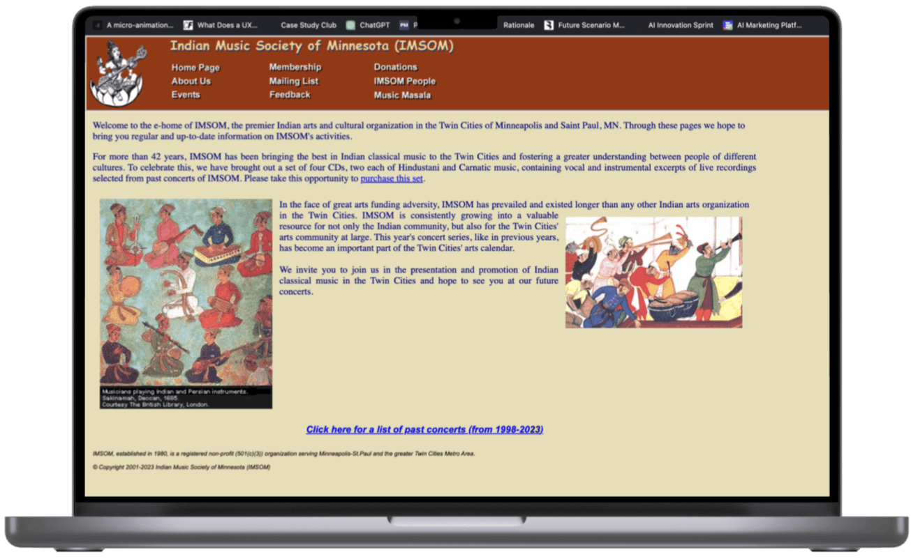
IMSOM - Indian Musical Society of Minnesota, has been a cornerstone in showcasing Indian classical music in Minnesota. However, despite its cultural impact, the NPO has seen a steady decline in online ticket sales and website traffic.
Old Website
The Goal
Redesign the IMSOM website to boost engagement & ticket sales.
My Role
Research,UX design and UI design.
Duration
Jan 2024 - Feb 2024
Solution
New Website Design.
An eye-catching blend of modern and Indian aesthetics for the American audience.

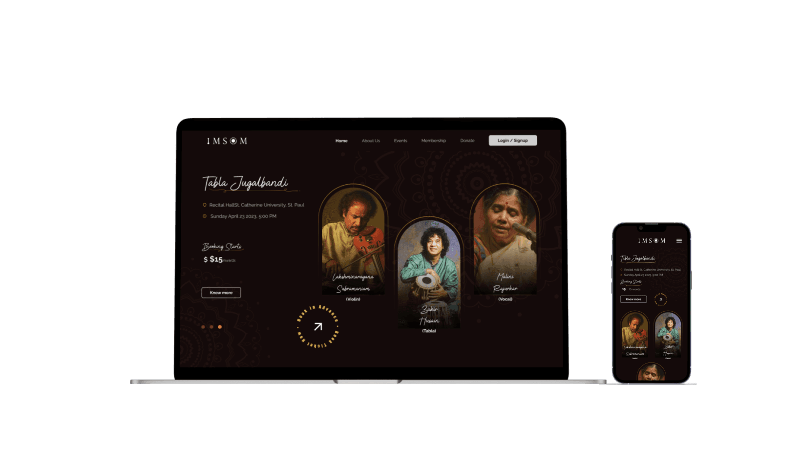
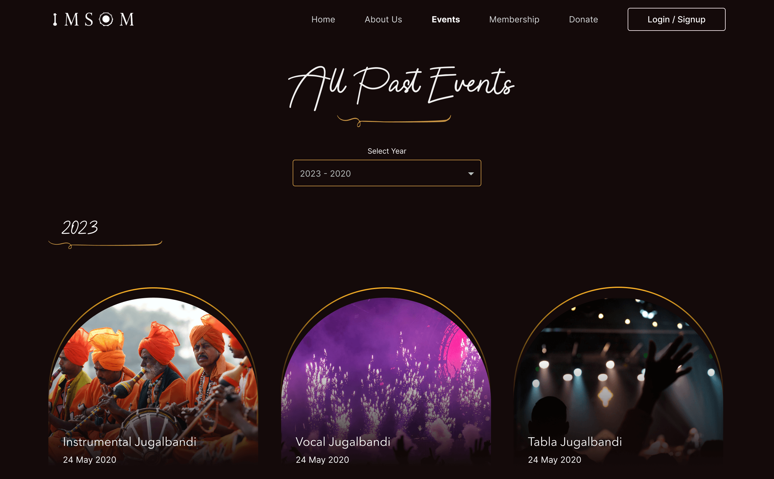
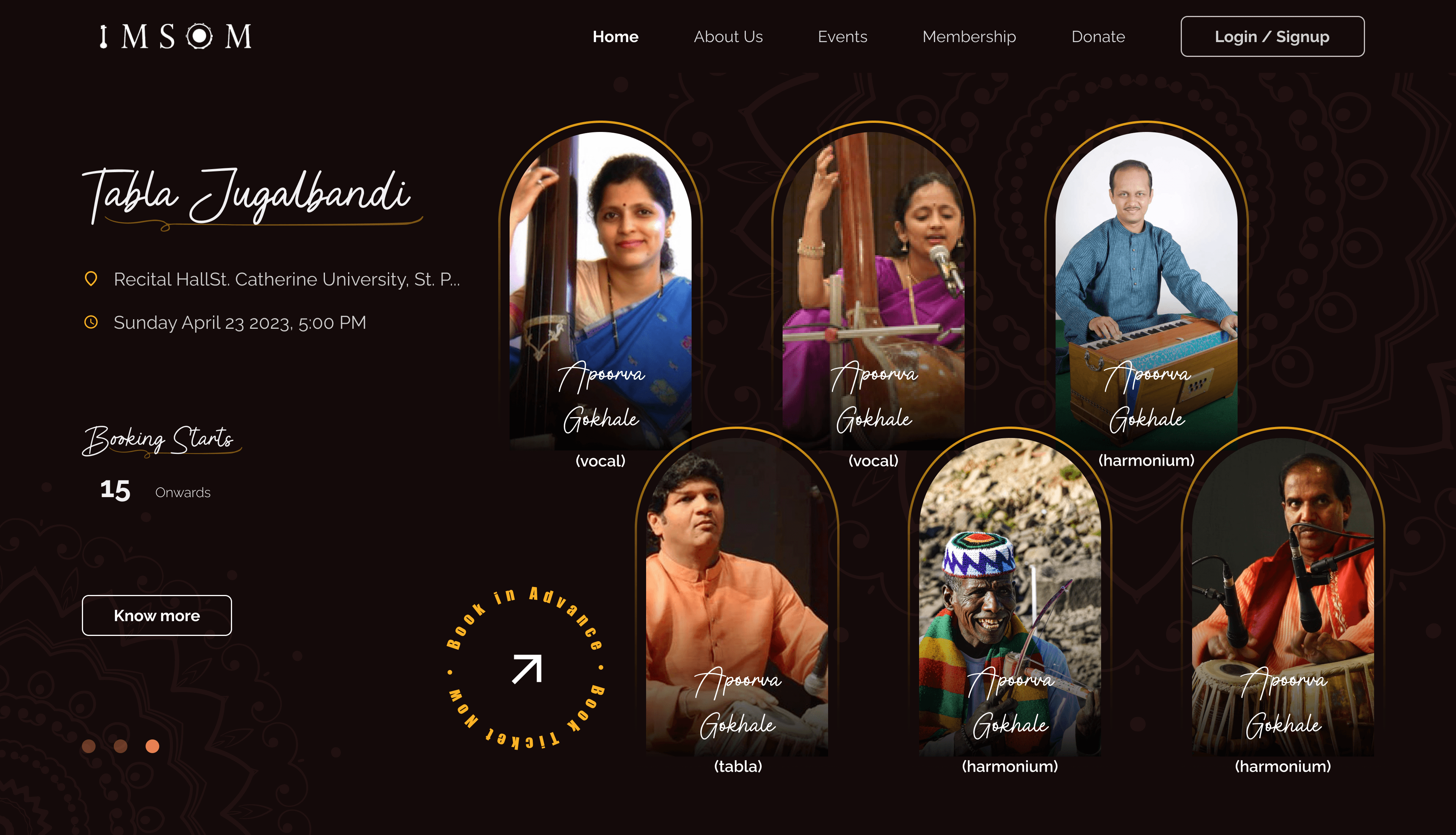
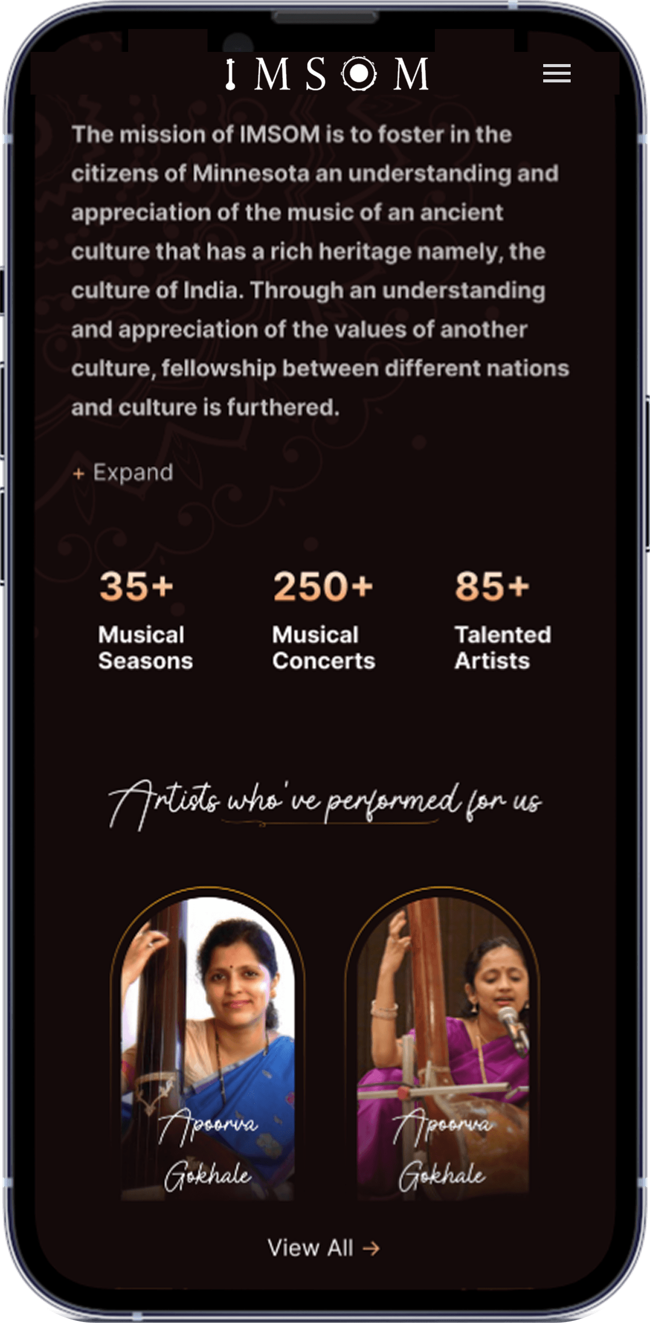
Homepage
The homepage blends modern and Indian aesthetics, using the arch shape, inspired from Indian architecture, as a key visual element.
Clear sections for events, membership, and past highlights guide users naturally toward engagement.
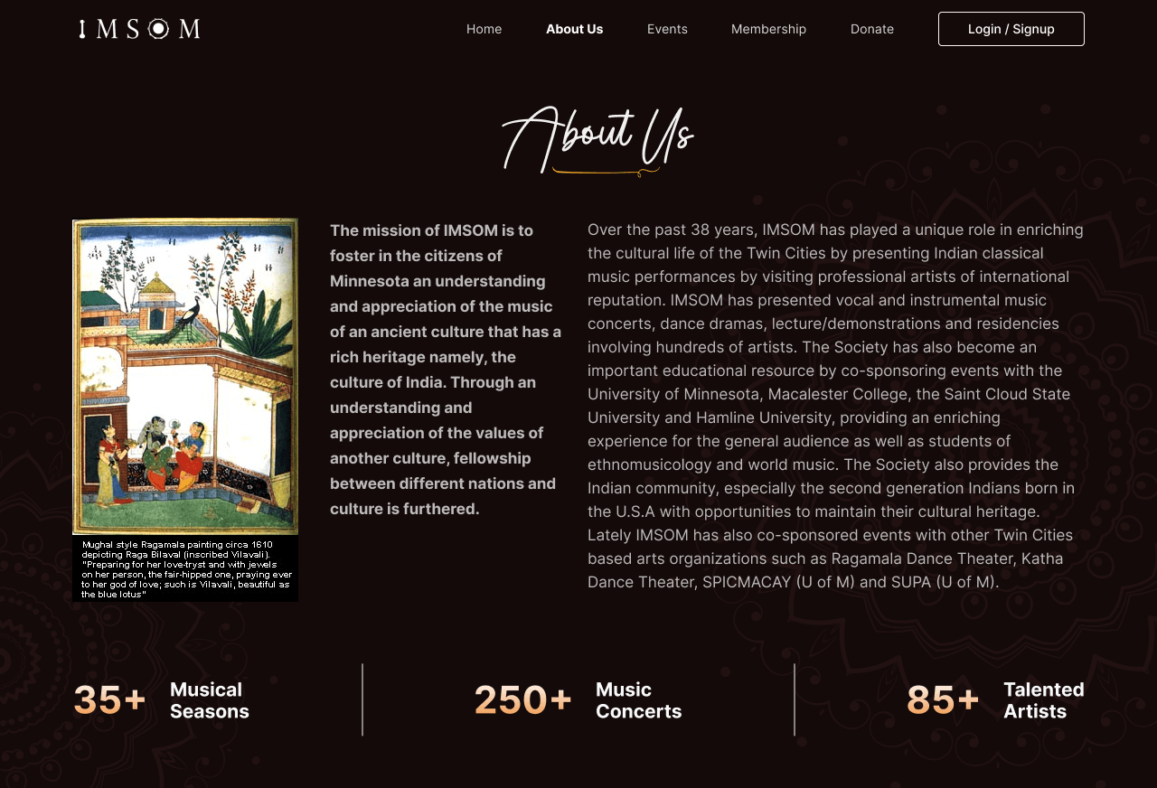
About Us
The design aims to build trust through cultural storytelling.
Stats and artist highlights provide social proof and drive engagement through emotional and reputational appeal.
Membership Purchase
Simple, clear membership page with hover effects that reveal a “Buy via PayPal” button to nudge quick decisions.
The confirmation screen intends to build transparency and delight.
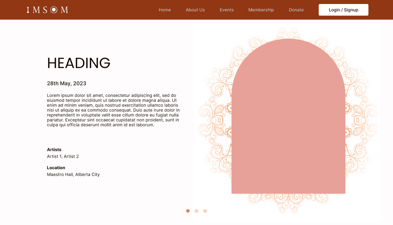
Ticket Purchase
Flow 1
Only the first attendee's details are required, allowing flexibility for additional guests.
Flow 2
Only the first attendee's details are required, allowing flexibility for additional guests.
How did the solution form?
Behind the screens
IMSOM needed a fresh approach, so we began by mapping their offline processes and then conducted primary research to align design with cultural expectations and user needs.
Understanding End Users
Focus Group Participants: 9
We interviewed the organizing committee to learn about internal operations and held an online focus group to capture user needs for the redesign.
Key Takeaways
1
Mobile-First Experience
Users predominantly book tickets via their smartphones
2
Simple & Transparent Ticketing
Users find the current ticket booking system confusing due to unclear pricing, eroding trust and deterring them from booking.
3
Inconsistent Brand Language
Inconsistent visuals undermined professionalism, reducing trust and engagement.
4
Large Text Blocks
Organizers wanted to keep large blocks of content while users value a clean and streamlined experience.
Design Decisions
After synthesizing key insights, I devised a strategy to balance both user and business needs. I focused on three clear objectives:
Solving for
Scalability
A modular design system with flexible, responsive layouts that can grow and adapt as new content or features are added.
Text Overload
Flexible content zones and dynamic typography to manage large text blocks while keeping the layout clean.
Cultural Balance
A visual style that fuses traditional Indian elements with modern design for an authentic, fresh look.
Visuals Explorations


One of the biggest takeaways from this project was to push myself to research even with limited resources and time constraint. I learned that the design process is never the same twice and that every challenge is a chance to make the most of what you have. Even when constraints felt overwhelming, they pushed me to think creatively and find simple, focused solutions that resonated with the users.